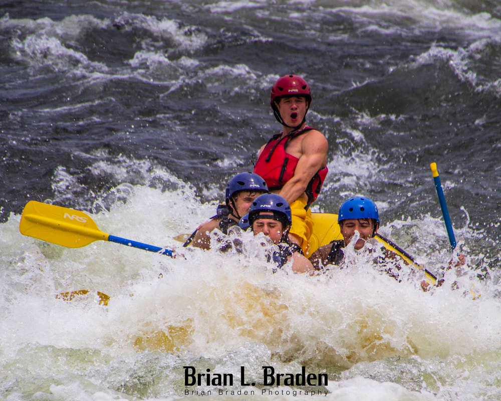
 Programming Note: I will be "offline" for a while, so this is the last post for two weeks. See you in July. Recently, my wife and I went on a weekend getaway to Columbus, Georgia, to celebrate our 32nd anniversary. Throughout the experience, my trusty Rebel T5 camera was my constant companion. It had been decades since I last visited Columbus, and I was astonished by the significant changes that had taken place over the years. One particular highlight was the delightful downtown river walk along the Chattahoochee. Much to our surprise, we witnessed kayakers and rafts navigating the rapids, right in the heart of the riverwalk. Despite my wife's slight annoyance, I immediately made my way to the river's edge and began capturing the scene. The weather was overcast, so I adjusted the ISO settings to approximately 200-400. Wanting a moderately wide depth of field, I knew that the Sigma 18-250 EFS lens's digital zoom would limit my ability to achieve low apertures, so I settled for around 5.6. To freeze the action and capture as many images as possible, I opted for a shutter speed well above 1/1000s throughout. I set the shutter release on high-speed automatic mode, although I must admit that, for a Rebel T5, the speed was not particularly high. The bottom line was that I aimed to capture the dynamic moments and ended up with a plethora of images. I have now shared some of these photographs in this week's blog post, and the entire experience has made me contemplate the importance of having my camera with me at all times. 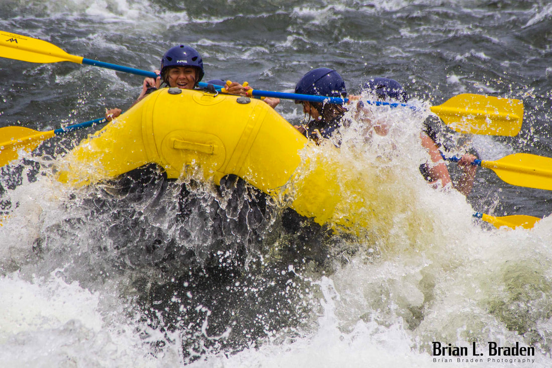 Having a camera with you is the key to capturing the shot. It's as simple as that. When you have a camera within arm's reach, you seize every opportunity that comes your way. Personally, I carry my beloved Canon Rebel T5 with me almost everywhere I go. I affectionately refer to it as my "everywhere/everyday camera." This term encompasses cameras that are always within arm's reach, whether it's in the back of your car, your trunk, your luggage, or your backpack. These everywhere/everyday cameras are like trusted companions that accompany you wherever you may be. Today, I would like to discuss the essential qualities that make a good "double-E" camera and provide some insights on how to make the most of them. 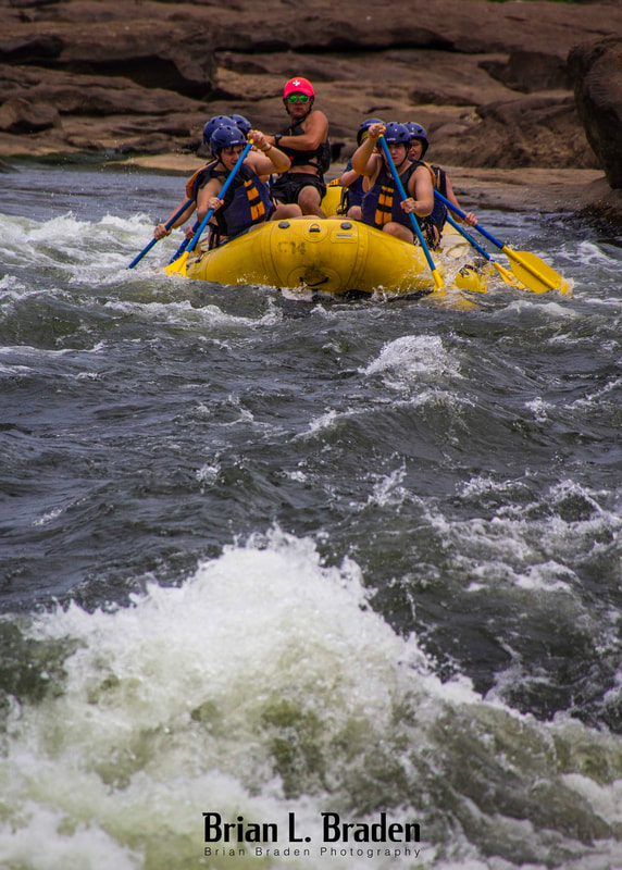 1. Replacement CostThe cost of replacement is a crucial factor when considering a double-E camera. If you cannot afford to replace it, then it is not a viable option to take it with you. The more you expose the camera to adventures, the higher the risk of damage or theft. Each person has their own perception of what is considered "cheap" or "inexpensive," but ultimately, it boils down to the consequences of a broken, destroyed, or stolen camera. A good double-E camera is one that you are financially prepared to replace. While I will undoubtedly be saddened when my trusty T5 eventually breaks or stops working, I won't be devastated. In such a situation, I will likely opt for another affordable Canon DSLR with a cropped sensor. This decision is primarily driven by the fact that I already possess compatible lenses, which are also relatively inexpensive, and there is a wide availability of used Canon Rebel bodies for sale. If your camera carries a hefty price tag, you will naturally think twice before subjecting it to the risks associated with carrying it everywhere. This consideration becomes even more critical with an expensive full-frame DSLR, as the act of using it can potentially shorten its shutter life (camera shutters have limited lifespans, as measured by "shutter click" counters). A camera that makes you hesitate before using it does not fit the criteria of a good double-E camera. It's not just the camera body, though; the lenses are equally important. Lenses often exceed the camera's cost by a significant margin. A high-quality "L" series EF pro-level lens may produce crisp and stunning images, but what if you accidentally drop it? In contrast, a cheaper EFS lens may not match the same level of quality, but it will come close considering the price you pay. For everyday use, the cheaper lens will likely suffice. It's a cost-benefit analysis, but ultimately, the key objective is to capture the shot! Expense and capability go hand in hand. The question to consider is how much capability you can afford to lose. When it comes to double-E cameras, various factors determine their suitability.  2. CapabilityCameras come in a wide range of shapes, sizes, and capabilities. If you're interested in delving deeper into this topic, I recommend reading an informative article from Adorama that categorizes camera models into 13 types. However, regardless of a camera's capabilities, it's important to remember that if you cannot afford to lose it, it shouldn't be brought along as an double-E camera. Here are several camera models that have the potential to serve as good double-E cameras, taking into account their capabilities in relation to your skill level and the subjects you typically shoot in your everyday adventures. For detailed descriptions of each camera type, please click on this link:
I often reference the cropped-sensor DSLR (APS-C) cameras in category #3 because that is the type I personally use as my go-to double-E camera. I consider them as the standard baseline for all double-E cameras due to their favorable balance between cost and capability. These cameras are typically considered entry-level for individuals who are serious about pursuing photography as a hobby or profession. While they have a smaller digital light sensor compared to full frame DSLRs, they offer most of the same functions and can often use the same lenses. Despite the increasing popularity of mirrorless technology, cropped-sensor DSLRs remain prevalent and affordable. It is possible to find a good used cropped-sensor camera at a reasonable price. Don't believe me? Just head over to Facebook Marketplace, type "camera" in the search box, and see for yourself.  Concerning Cell Phone Cameras...I strongly advise against relying on your phone as an double-E camera due to its limitations in terms of cost and capability. While phone cameras offer convenience and perform well in many situations, they primarily serve as tools for phone calls and applications. Their poor ergonomics make them awkward to handle and unsuitable for quickly adapting to changing photography scenarios. With their clunky design, they require intricate finger movements to set up and capture shots. Moreover, they are fragile and prone to being dropped and damaged. To illustrate my point, imagine having one opportunity to capture a clear shot of Elvis, the Loch Ness Monster, an alien, or Bigfoot. In such a scenario, would you prefer to rely on your phone or a dedicated and capable camera that you are comfortable using? Additionally, if the Men in Black were to appear and confiscate your camera afterward, would you rather lose the dedicated camera or your cell phone? For most people, the loss of a cell phone would be highly detrimental. These devices have become integral parts of our daily lives, and jeopardizing them is not advisable. It's not just the cost of replacement; it's also the data and functionalities tied to our phones that we rely on. In fact, many individuals experience significant distress when they misplace their cell phones—it's akin to a wizard losing their wand. If you don't believe me, I encourage you to watch the following video (note that it contains some strong language and may induce cringing). The bottom line is to protect your phone and aim for better shots by avoiding using it as your dedicated everywhere/everyday camera. If you are seeking an everyday/everywhere camera, I recommend utilizing a different device instead of relying solely on your cell phone. 3. Size and Weight - Grab and Go.As mentioned earlier, when your camera and lenses carry a hefty price tag, you tend to hesitate before taking them everywhere. The same consideration applies to weight and bulkiness. Personally, I avoid lugging around my heavy full-frame camera, along with its assortment of lenses, flashes, and support equipment, unless it is necessary for a paying client or a special occasion. An double-E camera, along with its lenses and supporting gear, should prioritize minimalism and lightness. It should be a "grab and go" setup. Here are some tips to ensure it remains that way: 
Of note: Consider whether you truly need a laptop for editing images. In most cases, it can wait until you return home. Be cautious about adding unnecessary weight. If a laptop is essential, consider purchasing a used MacBook Air or a comparable Windows system that can serve as a temporary solution until you can transfer your images to the cloud or your main computer. The kit comparisons below include my MacBook Air. Below are two images for comparison. The first image showcases my high-end professional 6D bag alongside my Canon Rebel T5 "grab and go" bag. The bag on the right is capable of fulfilling 70-80% of the functions of the bag on the left in most lighting conditions. In the second image, you'll find a motorcycle variation of my "grab and go" kit, excluding the MacBook. 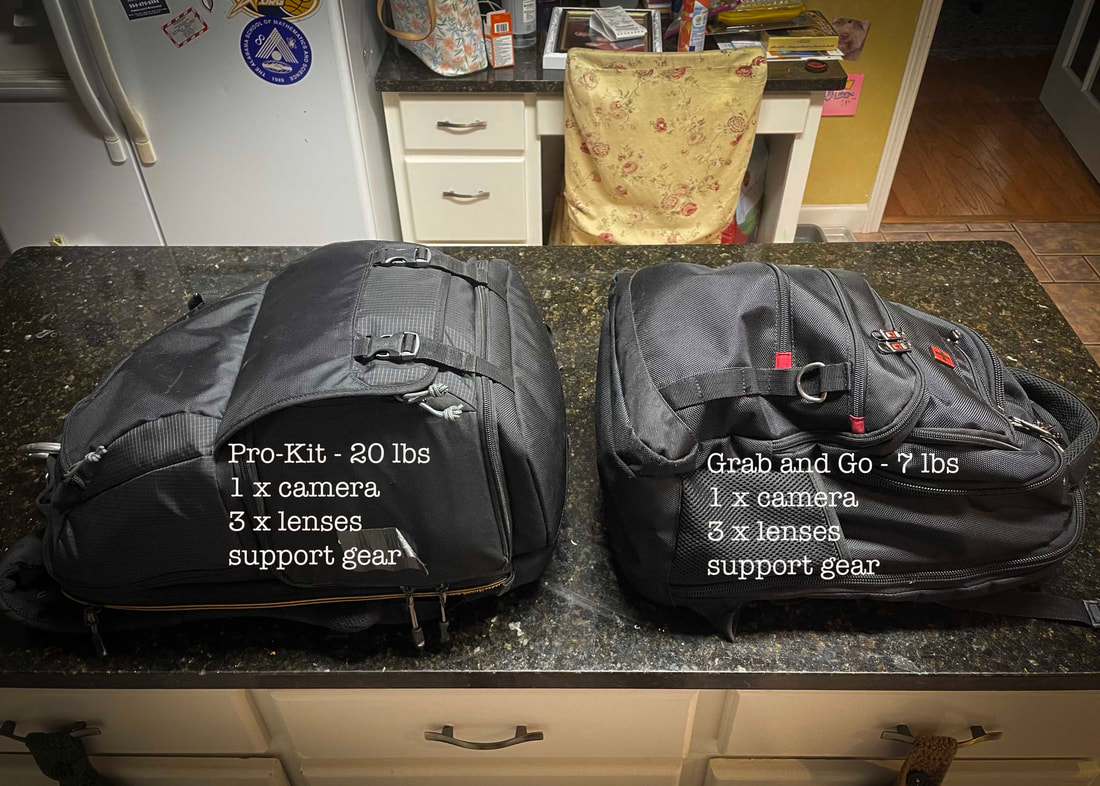 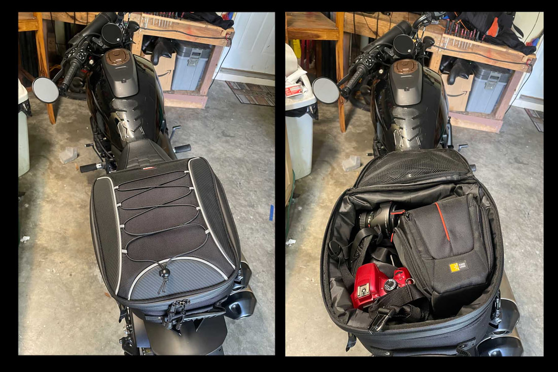 4. The Great Mitigator - Know Your Equipment.In most instances, an everywhere/everyday camera and lens setup will never reach the same level as high-end equipment. How can a photographer address the loss of capability? That is a subjective decision that solely depends on your personal approach. 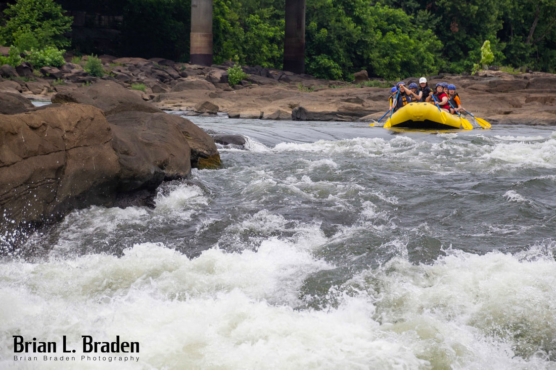
 Summary - Double-E's Make You A Better Photographer.Sometimes, the path to better photography lies not in purchasing more expensive equipment, but rather in having the right camera with you when you need it. Everywhere/everyday camera setups not only reduce risk but also incentivize photographers to take more risks and capture more photos. When it comes to a double-E camera, it's crucial to strike the right balance between cost, capability, and convenience. While expensive and bulky equipment may deter us from carrying them everywhere, choosing a lighter and more affordable option, like a cropped sensor or mirrorless camera, can be a wise choice. Understanding the strengths and limitations of your double-E camera and lenses is key to making the most of their capabilities. By compensating intelligently and making smart substitutions when needed, you can overcome the limitations and adapt to different shooting situations. With careful consideration and planning, you can ensure that your double-E camera serves as a reliable and versatile companion for capturing memorable moments wherever you go. 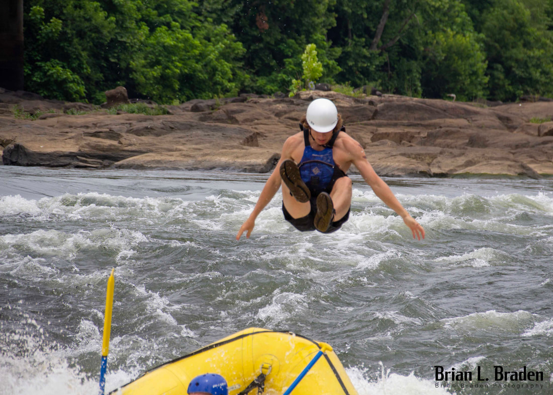 If you enjoyed this blog post, please like and share on social media. Also, please explore and shop my fine art photography galleries below. Autographed paperback copy of "Abandoned Wiregrass"
$24.99
Get "Abandoned Wiregrass: The Deepest South’s Lost and Forgotten Places" signed by the author! Welcome to the Wiregrass, a place where abandoned doesn't always mean vacant, and vacant doesn't always mean empty. Nestled between Florida's sugar-white beaches and the agriculturally rich Black Belt, there exists a land of endless peanut fields and high cotton. This is the deepest of the Deep South, Dixie's last stand before accents and culture take on a decidedly Northern flavor along the Gulf Coast and Florida Peninsula. Narrow asphalt ribbons wind through this region's pine forests, passing through small farming communities that are fighting for survival in the global economy. The lingering aftershocks of the 2008 economic crisis and 2018's Hurricane Michael still reverberate here. These pressures, along with an aging and declining population, have created a region where abandoned buildings are commonplace. These forgotten structures speak of dreams lost; from crumbling sharecropper shacks, to desolate main streets, to modern homes where the owners simply moved on. Take a journey with award-winning author and photographer Brian Braden as he chronicles the slow-motion apocalypse of abandoned homes and businesses of the Wiregrass and also discovers a place of hope and transition, where citizens fight to revitalize their hometowns and preserve a rich cultural heritage. Allow 1-2 weeks for delivery. BW003 - "Christmas Boll Weevil"
$7.00 - $99.00
Enterprise, Alabama goes all out to celebrate the Christmas holidays, including decorating the iconic Boll Weevil Monument. The only monument to an insect, the Boll Weevil turned 100 in 2019 and celebrates the transition from cotton to peanuts as the region's primary cash crop. Part of the Brian L. Braden "I Love Enterprise, Alabama" Collection. Click over image for expanded view. The physical print you receive will not include the watermark. Allow 2-3 weeks for delivery.. BW004 - "Winter Boll Weevil"
$7.00 - $99.00
A crisp winter sunset descends behind the Boll Weevil Monument and College Street. The only monument to an insect, the Boll Weevil turned 100 in 2019 and celebrates the transition from cotton to peanuts as the region's primary cash crop. Part of the Brian L. Braden "I Love Enterprise, Alabama" Collection. Click over image for expanded view. The physical print you receive will not include the watermark. Allow 2-3 weeks for delivery.. BW002 - "Parade Boll Weevil"
$8.00 - $90.00
The famous Boll Weevil Monument not only stands in the center of downtown Enterprise, Alabama, it also symbolizes the communities very heart. The monument is always stage-center at the community's celebrations, like the annual Christmas Parade. The Boll Weevil turned 100 years old in 2019. Part of the Brian L. Braden "I Love Enterprise, Alabama" Collection. Click over image for expanded view. The physical print you receive will not include the watermark. Allow 2-3 weeks for delivery.. EP001 - "Crimson and Lavender Sunset 01"
$7.00 - $99.00
It is March, and the sun sets over field of crimson and lavender on the northern outskirts of Enterprise, Alabama. Part of the Brian L. Braden "I Love Enterprise, Alabama" Collection. Click over image for expanded view. The physical print you receive will not include the watermark. Allow 2-3 weeks for delivery.. EP002 - "Crimson and Lavender Sunset 02"
$7.00 - $99.00
It is March, and the sun sets over field of crimson and lavender on the northern outskirts of Enterprise, Alabama. Crystal orb photography is a new medium for me, and I'm excited to include the art form in my various collections. Part of the Brian L. Braden "I Love Enterprise, Alabama" Collection. Click over image for expanded view. The physical print you receive will not include the watermark. Allow 2-3 weeks for delivery.. EP003 - "Crimson and Lavender Sunset 03"
$7.00 - $99.00
This field on the northern outskirts of Enterprise, Alabama has since been converted to suburb. I am glad I was able to capture it in full spring glory before it was gone forever. Crystal orb photography is a new medium for me, and I'm excited to include the art form in my various collections. Part of the Brian L. Braden "I Love Enterprise, Alabama" Collection. Click over image for expanded view. The physical print you receive will not include the watermark. Allow 2-3 weeks for delivery.. EP005 - "Enterprise April Sunset 1"
$7.00 - $99.00
A lot of pride greets visitors to Enterprise, Alabama as they roll into town from the north along Alabama Highway 167. Part of the Brian L. Braden "I Love Enterprise, Alabama" Collection. Click over image for expanded view. The physical print you receive will not include the watermark. Allow 2-3 weeks for delivery.. EP006 - "Enterprise April Sunset 2"
$7.00 - $99.00
The view that greets visitors to Enterprise, Alabama as they roll into town from the north along Alabama Highway 167. The wildcat is the mascot for Enterprise High School. Part of the Brian L. Braden "I Love Enterprise, Alabama" Collection. Click over image for expanded view. The physical print you receive will not include the watermark. Allow 2-3 weeks for delivery.. EP007 - "Sunset Over Enterprise Electronics 1"
$7.00 - $99.00
The sun fades in the west behind Enterprise Electronic Corporation. EEC has been an industry leader in weather radars since 1971, and is just one of many high technology businesses in Enterprise and the Wiregrass area. Part of the Brian L. Braden "I Love Enterprise, Alabama" Collection.
Click over image for expanded view. The physical print you receive will not include the watermark. Allow 2-3 weeks for delivery.. EP008 - "Sunset Over Enterprise Electronics 2"
$8.00 - $90.00
The sun slips behind a massive radar dish at Enterprise Electronic Corporation. EEC has been an industry leader in weather radars since 1971, and is just one of many high technology businesses in Enterprise and the Wiregrass area. Part of the Brian L. Braden "I Love Enterprise, Alabama" Collection. Click over image for expanded view. The physical print you receive will not include the watermark. Allow 2-3 weeks for delivery.. EP011 - "Bellwood Road Sunset"
$7.00 - $99.00
A derelict farmhouse house sits just south of town on a beautiful May evening. Part of the Brian L. Braden "I Love Enterprise, Alabama" Collection. Click over image for expanded view. The physical print you receive will not include the watermark. Allow 2-3 weeks for delivery..
0 Comments
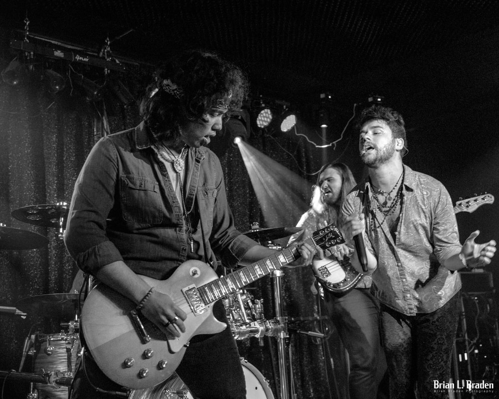
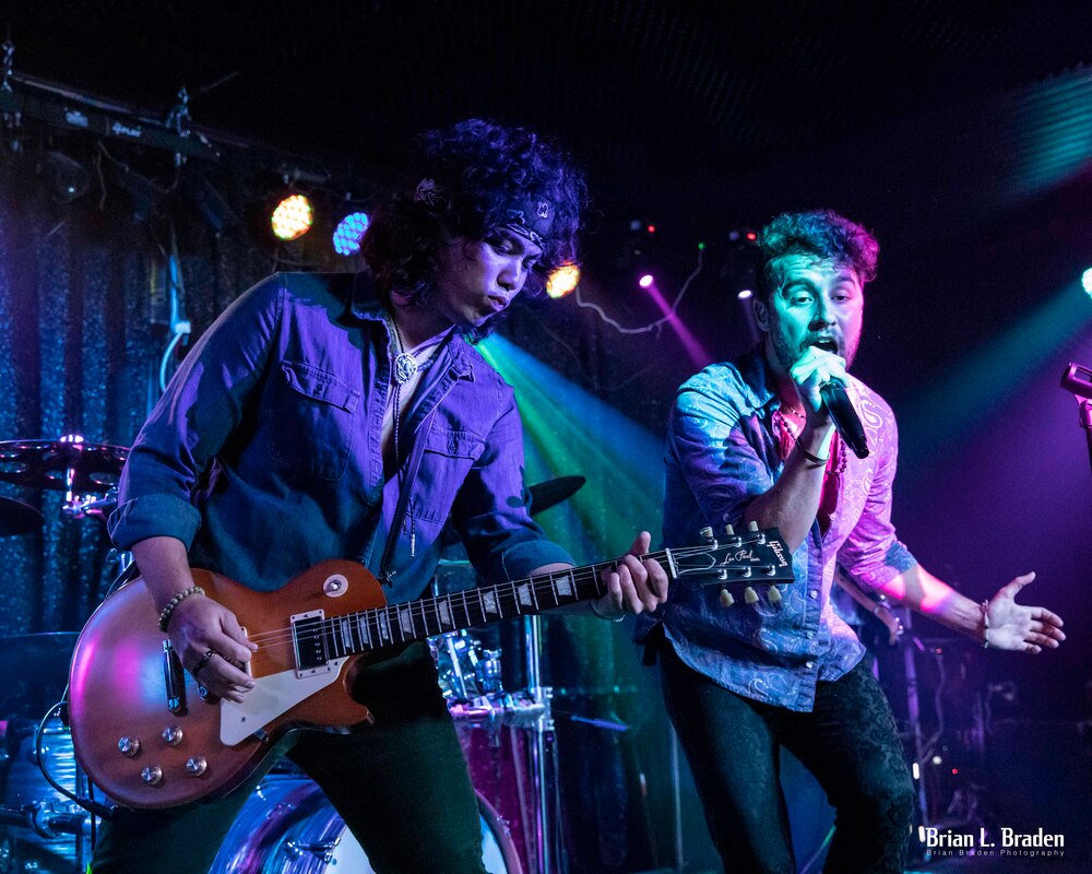
This blog post is for the photography buffs out there. Last weekend I had the honor of taking photos of Temple Monarc, a fantastic L.A.-based band with original music and a classic rock sound. Instead of just showing you some images, I'd like to talk about how I approach live performance photography. I learned photography primarily by taking live music performance images. Due to the dynamic challenges of light, subject and composition, it is a steep learning curve. It is a brutal way to learn the art, and I highly recommend it. Those lessons translate easily to any other genre of photography. I'd like to share some of those lessons-learned today, starting with equipment and settings. Equipment and SettingsEquipment I'm using a Canon 6DM2 with either a EF24-70mm or a EF17-40mm. Any DSLR or mirrorless will work as long as you can shoot on manual. Can you shoot on auto or with a phone? Of course, but you will eventually "peak" in your image quality. Here's why. Shoot on Manual You can't fully exploit the light when the computer does the thinking. There is so much more light the camera captures than what you see "straight out of camera" (SOOC). If you shoot on auto, the computer will either hide or throw that precious light away. Second, try to shoot with post-session editing in mind. When I see a composition, I've learned to see the light as I want it to be, not necessarily how the camera initially captures it and processes it on the display screen. This is where saving your image in RAW format is critical. Aperture I shoot at anywhere from f4 to about f5.6 because I want to strike a balance between low-light capability and reasonable aperture. For fast-moving bands, I don't like a lot of background blur. For slow-moving performers, and setting-dependent, I will go for more background blur. ISO Shoot as low-ISO as possible to reduce noise. Low-light forces higher ISOs, but I detest grainy images unless I intend to go mostly black and white. Low-lit clubs and music venues usually drives me to somewhere between 6400 and 12500 ISO. Shutter Speed I set my shutter speed as high as I can get it, even if that means slightly under-exposing the image. I won't shoot performer on low-lit stages under 1/125s. This keeps blurring down (unless I intend it). One can lessen the impact of under-exposing an image if you shoot with spot or center-weighted light metering. That means taking your light readings from the image cent er or where where your focal-point is. I use either of these settings depending on stage light conditions. I want my light-meter taking the light sample from where I want it, not where the computer thinks it should be. If the background darkens up, so be it. Focal Point Focal-point control is everything in rock & roll photography. Focal point drives composition! Use the smallest AF point your camera will allow, and make sure you understand how to dynamically change your focal-point quickly. If you let the camera control the focal point, you'll throw away a lot of images and miss a lot of great shots. Image Speed Set your camera to take multiple images at the highest speed. Also, make sure your data card is clear and ready for lots of images. All of this is important because of rock and roll. These settings give me maximum control of light and composition, and result in the best post-session editing options. Now, lets take a look at them in action. ApplicationThese two images were taken 30 seconds apart, yet that 30 seconds changes how each image was edited. In the first image, I chose black and white, yet in the second image I chose color. Why?
Subject & CompositionSubject and composition are directly tied to focal point. In both of these images I set up my focal point on my viewer's far right, with the intent of using the vocalist as my subject. Specifically, I am following the singer's left eye in both images. Based on my camera settings, the singer is the subject, I've automatically framed my composition, and light meter is reading the light reflecting off the singer's face. FOCAL POINT ANCHORS YOUR SHOT. Rule of thumb: The lower the light, the lower the aperture, and therefore the tighter the focal point. In image 1, composition and contrast are most important, so I selected black & white to accentuate this. In this instance, structure and subject interplay trumped color. Do you see all the triangles and arrows in Image 1? The bass player is visible behind the vocalist. The three performers heads form a triangle. Both he and the singer are facing the guitarist, who is looking at his guitar neck, which is pointed right at the lead singer (triangle) If you draw a line from the top of the singer's head to the bass player's head, it forms a line that points at the guitar (triangle) which points right back to the lead singer (arrow). If you look at the bassist's instrument, it protrudes from behind the singer on a straight line, as if the vocalist is being pierced (arrow) by the guitarist. The singer is looking at the guitarist's face, who is looking at his guitar, which points right back to lead singer (triangle). Now, look at the spotlight. It is simultaneously a triangle and an arrow piercing all the other triangles, and pointing at the center of all of Image 1's triangles - the guitarist's left hand. Leaving Image 1 in color, with all the different colored lights, would have been distracting. The image draws its power from composition, not color. Image 2 has a far simpler composition. Here, we have only one triangle. The guitar forms the base, and the performer's heads point to the apex. The bass player is hidden, and the image is uncomplicated, and color does not distract. LightIn Image 1, the lead singer's face is fully in the blue-green spot-light. Behind him, the bass player is visible, he is facing us, and his light source is the same color, and close in illumination, to that bathing the singer's face. Therefore, the camera handles the white balance for both performers the same. When converted to black and white, the two performers' faces will handle editing identically. The guitarist, however, is getting different light and the light metering is not "seeing" him. Therefore, he's darker. He is also dressed in a color similar to the stage lighting and blends in, but his guitar is more reflective and has a higher albedo. By going black and white, his guitar "pops" and forms a high-contrast bottom for several of the composition triangles. Bottom line, I get more bang for my editing buck for Image 1 in B&W, and Image 2 works as-is. EditingIn post-production editing, it quickly became clear Image 1 would have far more impact as black and white. Using the BW Mixer in Photoshop Camera Raw, I can covert colors into contrast. By increasing illuminance on aquas and blues, I can make the singer and bass player's faces brighter, as I can with the reds in the lead guitar. This reinforced the composition triangles and gives the image more clarity. Image 2 needed almost no editing, other than a change from 6x4 to 8x10. SummaryTwo images, 30 seconds apart. Same subject, same focal point, same settings, and two entirely different outcomes. I hope you enjoyed this week's blog. #photography #photo #camera #photoediting #photoshop #music #musicphotography Please join me on my journey. If you enjoyed this blog, please like the post and leave a comment or if you're feeling brave, share it on social media. This platform is my entire advertising budget and is how I share the word on my books. Also visit my Facebook, my author page and check out my fiction books here book here.
I promised to talk about composition this week. I've been dreading it. Why? Because one cannot discuss composition without talking about THE RULE OF THIRDS. Every photography blogger, tutorial, video and expert on the interwebs has talked about the Rule of Thirds. There isn't much new to cover in this area, so I'll cover it my way - short and to the point.  Most cameras and phone cameras have options for placing a Rule of Thirds grid on your view finder or screen. The Rule of Thirds dictates that its best to put your subject in one third of your composition (one side or another), and leave the other two-thirds open. That's it. It's nothing more complex than that. Experts say this provides balance to your composition. As crazy and as simple as it sounds, it works. It's been proven repeatedly using this basic ratio for composition provides a more balanced and pleasing image. Why? Some say it has something to do with The Golden Ratio, which is a mathematical ratio of roughly 1.61. When you do magic math stuff it creates a spiral like the one below. Scientist and other smart people say The Golden Ration is present everywhere in nature, and generally God thought it was a good idea. Notice, the spiral tightens in one third of the image. Essentially, the ROT and GR are expression of the same thing.  This is a visual representation of Golden Ratio. Some cameras give you the option to use a GR grid in addition to a ROT grid. This is what you need to know about to use these composition tools. 1) Your camera or phone likely has a menu function to place a grid or ratio image in your viewfinder or screen. This will allow you to template your image. 2) You can also set the manual focus points on your camera to focus your subject on one side or the other. This will ensure you are using the ROT and to make sure you're focused on your subject. We'll cover these tools in future blog posts. 3) You can also crop an image to get the ratio correct, but that is a last-ditch move. Cropping degrades your image quality. Its best to get the ratio correct when you take the image. Why do I think ROT is important? Using this ratio allows the photographer to set up their subject and give it context. It allows you to frame your subject, and provides room to "dress" up the subject with light, context, leading lines, or powerful settings. IT GIVES YOU ROOM IN YOUR IMAGE TO TELL A STORY. That's it, the Rules of Thirds in a nutshell. I'm going to leave you with one of my images which I think demonstrates the ROT. Notice the vase is the subject, and its center occupies the left 1/3. It is the focal point. The vineyard provides both context and leading lines. The hills beyond bisect the vase's top, which then leads you to the vineyard, which leads to the vase. The bush isn't ideal, but sometimes ideal isn't possible. However, the bush does provide balance and blends with the greens so isn't so noticeable. It also leads your eye back to the vase. See you next time.  "Soda Rock Winery #5, 2021. Canon 6D, 70-200@154mm, f14, 1/640s, ISO800, partial metering. ***
If you enjoyed this blog, please like the post and leave a comment. Also visit my Facebook, my fine art photography and check out my photography book from America Through Time, "Abandoned Wiregrass: The Deepest South's Lost and Forgotten Places." PHOTOGRAPHY PHRIDAY, EP 5: SUBJECT, PART 2. Focal Point and Depth of Field as it relates to Subject.9/17/2021  The concept of subject isn't a simple as it sounds. The concept of subject isn't a simple as it sounds.
We talked last week about subject. Subject is what you are photographing. It’s what you want the viewer to see. Everything else in the image supports the subject. It could be the tiniest insect, a child, a bride, or the Grand Canyon.
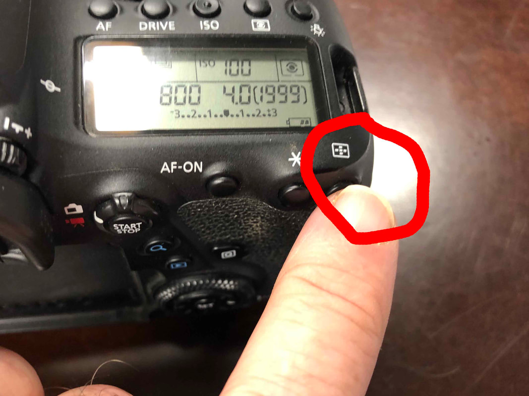
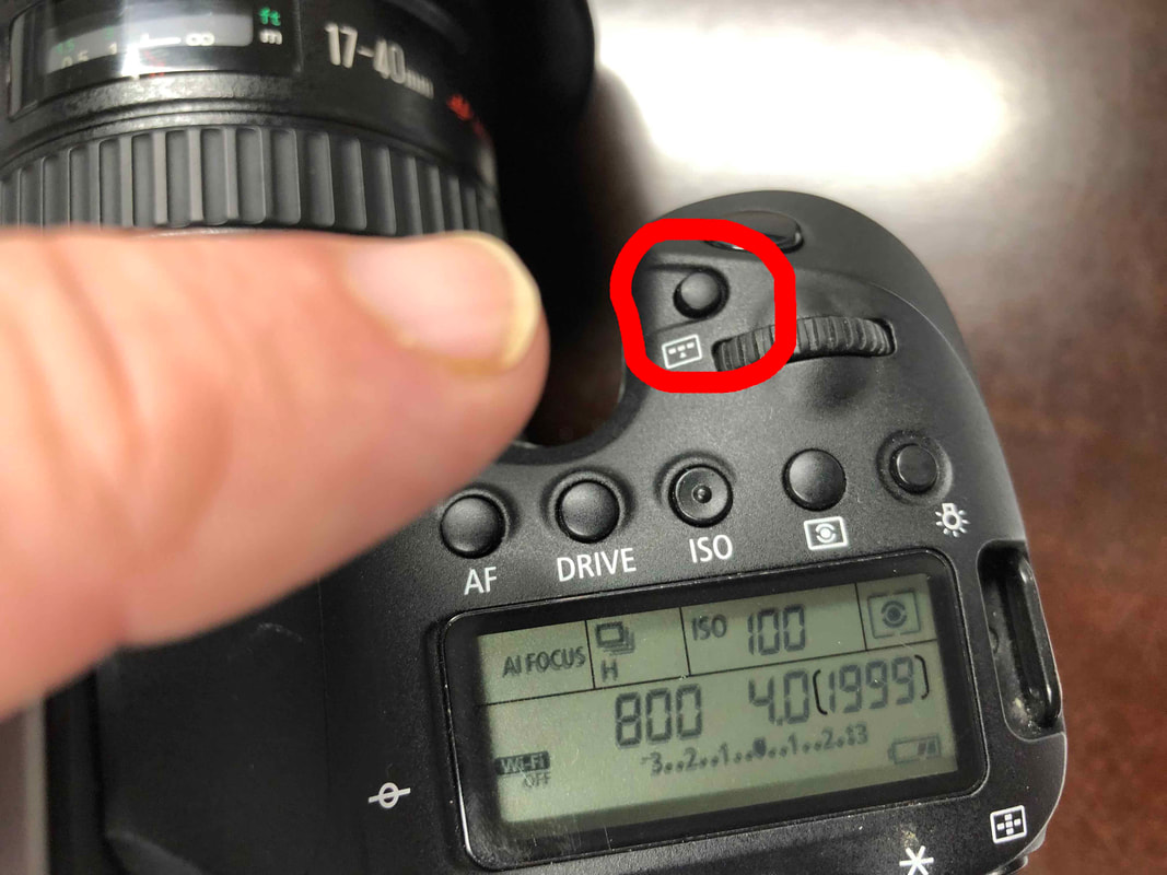
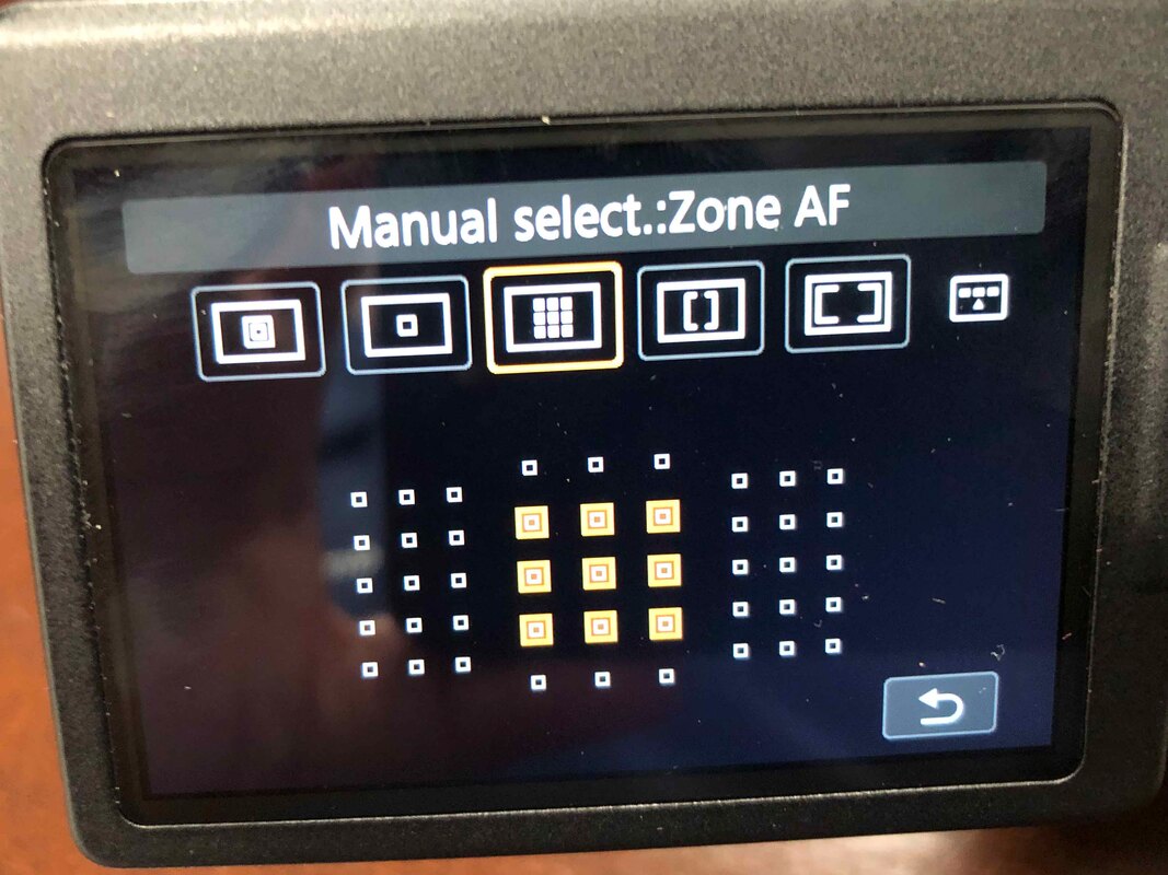
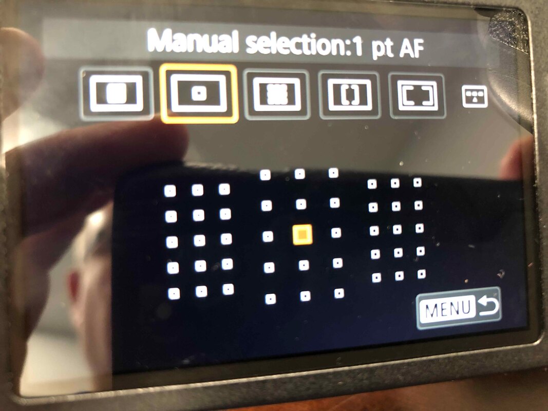
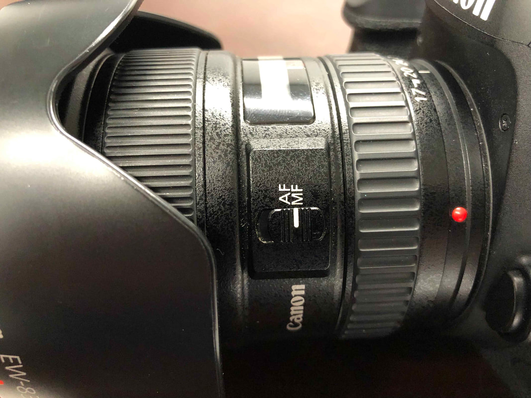
Here’s the first question you should ask: “What is my subject?” On the surface, it seems like an easy question to answer: it’s a person or defined object. I recommend tweaking that question to “Where do I want my viewers eye drawn?” Your subject might have a subject! Is it the model’s stunning eyes? Is it your child’s beautiful smile? Is it a lone tree out on a prairie? Is it one person in a crowd or the crowd itself? Is it the tree or the beam of light shining through the branches. The subject’s subject is where you place your focal point. There is a relationship between focal point, depth of field and your subject. That relationship will determine your first camera settings: focal point and aperture. Focal point is that box, boxes or dots that blink around the area when you point your phone camera, or the boxes that blink when you press your shutter button on your DSLR or mirrorless. If you’re shooting on a phone, or in auto, the software will determine your focal point. This can be good and bad. Good it you have to get the shot quickly, bad if the device picks a spot you don’t want. I highly recommend taking control of focal point. Don’t let your camera pick it for you! If you have a DSLR, there will be a button somewhere on your camera or as a part of your control screen that allows you to take control of you autofocus point. Controlling the focal point is the first step in mastering your camera and getting the image you want. Cameras come with more than one focal point and it doesn’t have to be in the middle of the image The more advanced the camera, the more auto focus points it has. Press the focal point button on your camera (the image I show is on my Canon) and start playing with adjusting its size and placement. It will differ from camera to camera. There are plenty of videos on Youtube that can teach you this depending on your model. If you really want to get creative, turn off the autofocus entirely and use the manual focus ring on your lens.
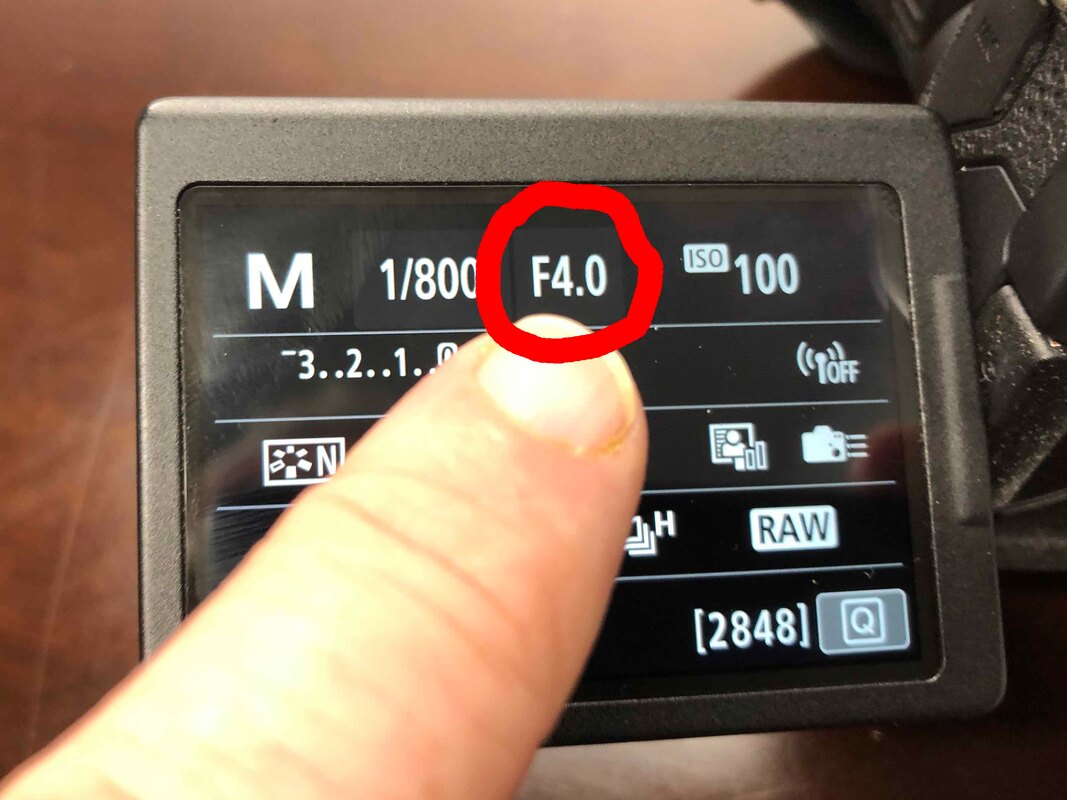
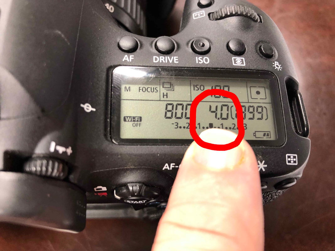
Aperture is depth of field, or how much of the image is in focus. This is measures by the “fX.X” number on your lens. There are lots of factors regarding aperture, and we won’t get into all of them today. The lower the f number, the blurrier everything gets outside your focal point. The higher the number, more of the image is in focus. It’s more complicated than this, but this gives you the basics. Here’s the important part: If you are shooting below about f7.0 you better know exactly where your focus point is, or your subject may be blurry.
Here are some examples of focal point and aperture in my own photography. This landscape is a wide angle shot (18mm) with a wide depth of field (I seem to remember about f7.0). The focal point & subject are the barns, but I wanted a great deal of the field is in focus, too.

This photo has a narrow depth of field (f1.8) and a tighter focal range (50mm). This called for a precise focal point on the flower's stamens (my subject's subject), and letting everything else blur into shadow and color.

The rule of thumb I use is the more shallow the depth of field the smaller you want your focal point, such as using only one point or block. If you are doing broad, sweeping landscapes at deep depth of fields you want a broad focal point. The auto focus points don’t have to be in the middle, either, but we’ll talk more about that when we get to composition another day.
If you want close up and intimate, then you want wider apertures, like f4.0 or lower. This will concentrate the viewer on one spot and let the rest of the universe melt away. If I have a zoom lens and I’m using it at high, tight focal lengths, I usually also want to use lower apertures. So to recap, a good rule of thumb is the tighter, closer and more intimate the shot, the smaller your focal point. This allows you to focus exactly on what you want. The wide, broader and larger the subject, the bigger the focal point. These are guidelines, not rules. So to recap: 1) Control your focal point. 2) If your depth of field is shallow, use a more precise autofocus point. 3) If you are zoomed in, use a smaller focal point, too. 4) Loosen up the focal point as you zoom out and as you depth of field increases. These are the first steps to ensure your subject is what the viewer’s eye is drawn to. Next time, we’ll discuss subject as it fits into composition. Next time we talk, we’ll start bringing composition into the mix. Thanks for stopping by! *** If you enjoyed this blog, please like the post and leave a comment. Also visit my Facebook, my fine art photography and check out my photography book from America Through Time, "Abandoned Wiregrass: The Deepest South's Lost and Forgotten Places." #photography #subject #photographytips #tutorial #photographytutorial #howto #photographylessons
Before I go into detail on the topic of subject in photography, I'd like to show you a few example of subjects in my photography. Simply put, subject is what you are shooting. It's the photos topic, its theme. It could be anything, but it's purpose it to draw a desired reaction from the viewer. It should conjure a desired emotion, idea or concept. For portrait photography, the subject it easy - it's the person you're photographing. For landscapes, it may be more difficult to pin down. My rule of thumb in defining subject in my photos is easy - where is my focal point AND where is the composition leading the eye. Where do I want the viewer to be drawn?
In the first photo below, "The Gyro Captain", my focal point and subject it the pilot himself. Everything else in the composition supports the subject. In my second photo, "The Boy Scout", it's the boy in black and white, not color. Why? The reflection is a leading line drawing the eye to the black and white image, which is where my focal point is. In "The Remembered Aviator" I use both focal point and composition to frame the statue, which is the subject. In "Abandoned Wiregrass" I use the rule of thirds and focal point to place the shack in the reader's attention. That's all for now, more on subject later. Next time I'll dive into detail on the basics of defining subject in your photo. If you'd like to see more images please visit my gallery here. #photography #subject #photographytips #tutorial #photographytutorial #howto #photographylessons 


 Welcome to Photography Friday on The Illusion Exotic. No, this article isn’t about the band REM or 80s music. It’s about taking your first steps into photography.
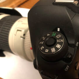
Let’s say you bought or were gifted a DSLR (digital single-lens reflex) or mirrorless camera. Maybe you were just curious about the technology, or simply wanted to take nice photographs of your kids. It may be a Canon, it may be a Nikon, or a Sony or a something else. It could come with interchangeable lenses. It might be a what’s called a “cropped sensor,” “full-frame” or maybe it’s a high-end mirrorless. Maybe you don’t know, and maybe you don’t care. You’ve read some of the instructions, and you’ve watched a few YouTube videos. You’ve got a few hundred to a few thousand dollar’s worth of camera in your hands, and you haven’t managed to move that little dial on the top off of “A” yet. By “A” I mean you’re still shooting in Automatic. Everything you’ve read and watched says you should be shooting in “M”, the Manual mode. I mean, the tutorials say you’re not a real photographer if you’re shooting in Automatic, right? You want to shoot in Manual mode, or maybe one of those other complicated modes (“T” and “S” or whatever your model calls them, but its’ all so complicated, your life is busy, and you really don’t have the time to learn. You just want to take good photos. Many of the blogs, articles, photography denigrate the Automatic mode, and relegate to a place of shame. Take a deep breath and relax, and embrace the “A”, at least for now. Automatic mode takes care of the hard parts of being a photographer. The computer built inside your camera takes care of everything except pushing the button. Details change slightly from camera model to model, but in Automatic your camera handles focal point and the light triangle (aperture, shutter speed and ISO). Your expensive, high-tech camera becomes a glorified “point and shoot”. And that’s a good thing, because you paid for it. It’s okay to spend some time in Automatic before you move on to your camera’s more complex capabilities. There are two critical elements you should learn and become comfortable with before moving off of Automatic to the other modes: Subject and Composition. Subject is what or who you are photographing, and how you are trying to use the subject to elicit a reaction from the viewer. In my opinion, subject is the most important way to connect with the viewer. For example, if you are taking photos of your kids, then your kids are the subject. They elicit the reaction. Subject can immediately draw someone into your photograph, or turn them away. Powerful subjects can overcome poor composition, but usually subject and composition are woven together into a whole. Here’s a YouTube video on selecting subjects for photography. It also delves a little into composition. Composition is simply how you frame and set up your shot to draw attention to the subject. Its where and how you place your subject in the scene. Once again, there are plenty of free tutorials online that teach composition. You’ll learn tried and true techniques like “golden ratio” and “rule of thirds” that help you set up your shot. Here’s a YouTube video talking about composition. That’s the great thing about Subject and Composition, You can learn much about them without ever moving your camera dial off Automatic. Understand and get comfortable with these concepts early on and you’ll find the more technical aspects of photography less intimidating. You can also practice Subject and Composition with your camera phone. When you get comfortable The next step in your photographic journey will be lighting. To understand that aspects, you’ll have to move the dial off “A”. We’ll tackle that step next Friday. #photography #tips #photographytips #photo #cameras #canon #nikon #creativeauto #cameratutorials |
Archives
July 2023
Categories
All
|
 RSS Feed